Sunday, September 30, 2012

Costume College - Sunday

I was pretty worn out on Sunday. No wonder, with the late night! Once again I did not make it to the Sunday Undies breakfast, although I did not sleep in very late.  I took it easy, did lots of final shopping, and went to a class on 1860s jewelry that was really good.

I knew I would be tired and not feeling like making a lot of effort, so I wore my block printed Regency gown. I didn't get any pictures in it, so here are some old ones from last year's DFWCG Georgian picnic.
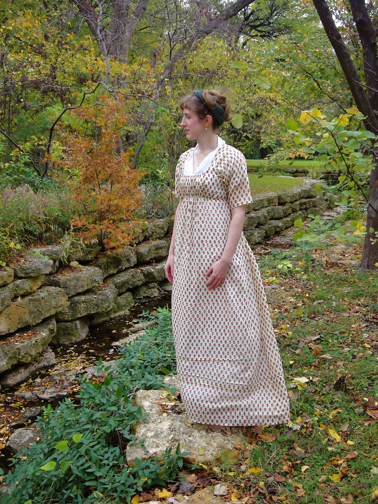
Photo courtesy Jennifer Thompson


Photo courtesy Jennifer Thompson

This time I accessorized with my new red stone brooch, a green ribbon sash, and a turban made from a dark red shawl.  American Duchess's tutorial was really helpful!  I wore it with lots of curls, similarly to the black and white Regency from the Friday social. I also pinned on the clear rhinestone brooch to the turban. It looked good! Too bad I don't have any photo proof.


On Sunday afternoon, I changed into very casual vintage wear, to be comfy by the pool. I ended up visiting with Teresa for a long time, which was great.

When we made it to the pool, several other people were at the inside pool.  Lauren was wearing an amazing c. 1940 Vogue outfit, so I took a few pictures for her on a great stairway by the pool.
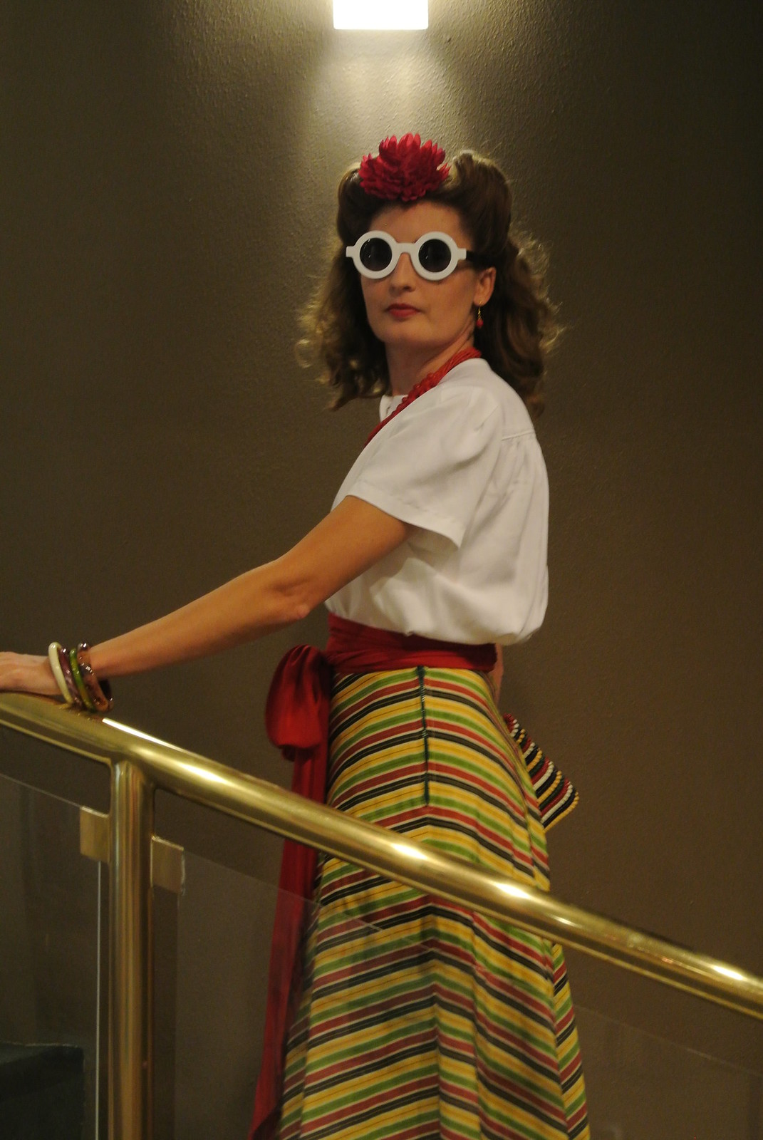
Photo courtesy of Aubry


Photo courtesy of Aubry


I accidentally left my swimsuit at Lauren's house, so I wasn't able to actually join in the swimming. But I did wade in as far as I could and threw the ball around!

Photo courtesy of Aubry


It was such a comfortable, relaxing time, a great end to Costume College proper.


The next day we went back to the garment district. I already covered that in my shopping post, so that's it for Costume College 2012!

Friday, September 28, 2012

Costume College - Saturday - Gala

Gala time!

Getting dressed was a breeze compared to last year. We missed the red carpet arrival entirely!  This year, I had a few tricky moments with safety pins, but on the whole my outfit went together easily.

Lauren and her husband ready to ago, with Perry the Platypus, who alas! did not make a red carpet appearance.


In tribute to the Golden Age of Hollywood, I went as Maid Marian, as played by Olivia de Haviland in the 1938 Robin Hood.  (With Errol Flynn, in Technicolor!)

Original film still

On the red carpet (photo courtesy Arandale)

I love this costume. Love it!  It took so much work to make, but the pieces really came together. It's amazing to wear.


I think we turned out pretty good! (One of the husbands was being silly behind the camera, and  can't control my face. :D) (Photo courtesy Beth)


Stephanie in blinged-out 1950s.

R. in silk charmeuse, copied from the 1930s Hitchcock Secret Agent.


Beth in Regency and husband in vintage formal wear. (Photo courtesy Arandale.)

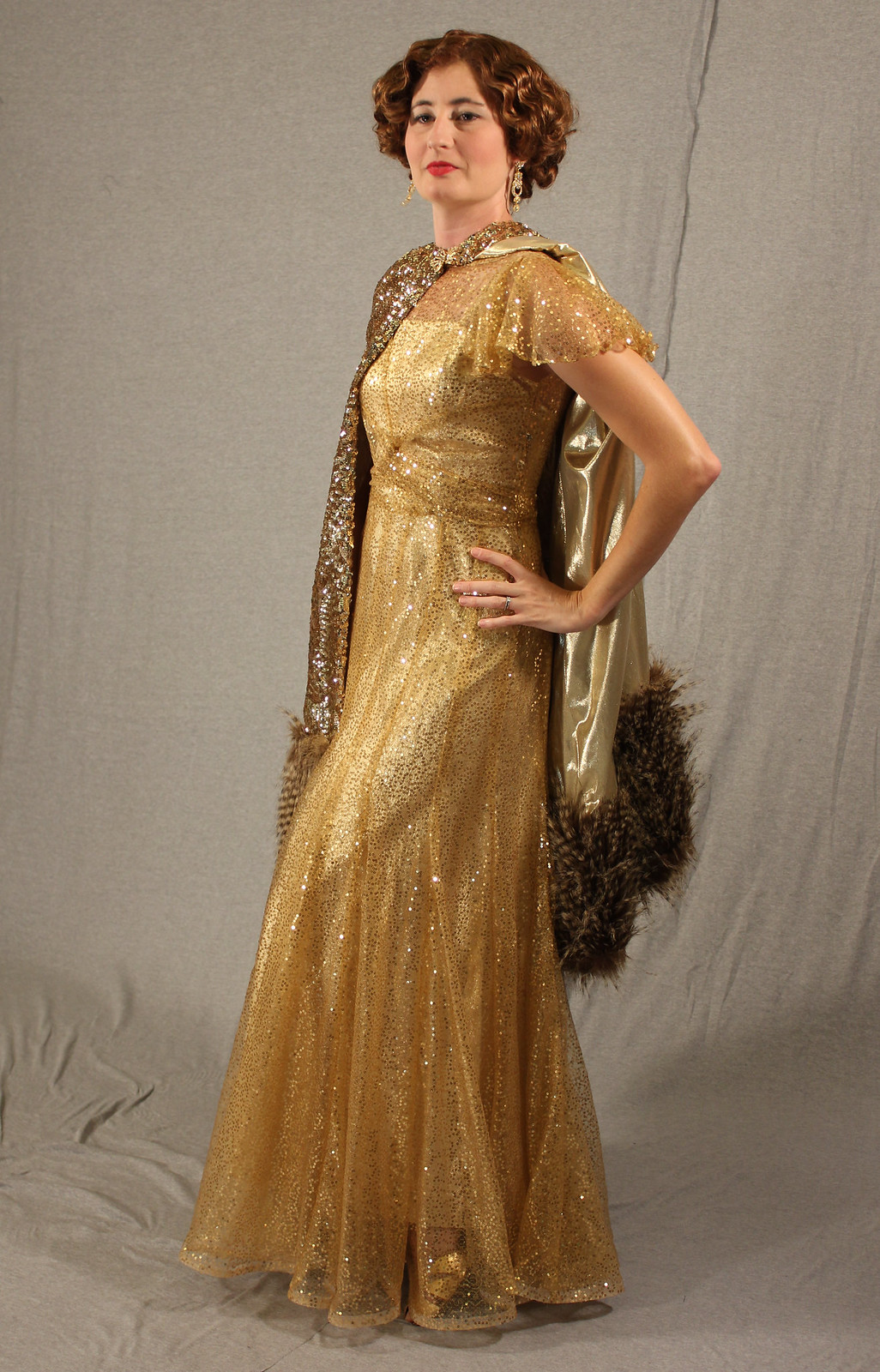
Lauren's gold 1930s, complete with squined and (fake) furred cape. (Photo courtesy Beth.)


I had a lot of assistance replicating... (Photo courtesy Jitteringbug)


... this original continuity still.

Did it turn out all right?
We stayed for the entire Red Carpet arrival, then walked across the street to dinner at P. F. Chang's, which was new to me and YUM. Incidentally we (I?) made the night of two wee little girls who never said a word, but just hovered and grinned, and shyly showed me their sparkly shoes!

Beth took no risks with her gorgeous dress.

Afterward we watched the Gala dancing.

Lauren and Beth and their husbands danced to several songs. Ever seen the Balboa danced in a Regency gown before?


Two fabulous golden ladies (Lauren and Katherine) and their cameras.


The awesome and delightful Megan in her fully accessorized cross-barred silk francaise.
 Shortly after I took the above picture, Megan announced that the evening was to the point where she usually took her dress off.  "!!!" was my initial reaction. Aubry did not hear, so I sneakily got my camera ready.


Megan starts taking out pins and Aubry figures it out.

Dress coming off!

Back to the dance! (That wasn't so bad!)

I didn't stay for the end of the dance; we went back to our rooms, but not to bed right away.  We stayed up way too late talking and unwinding. It was a great night!

Thursday, September 27, 2012

Clarification

It was pointed out to me (by a very smart person!) that my post on home design and style came across pretty harshly toward a lot of popular design schemes. Re-reading it, I can see that!

source
I want to make it very clear that that post was exploring my own preferences, my personal quirks, my likes and dislikes, in my own space.  I was making no statement or judgment of anyone else's preferences.  I know many people really love the lived-in, vintage feel of shabby chic; many are calmed by the clean openness of minimalism; and so forth.  That is just fine. In fact, it's great!  When it comes to design and style, do what you like, within your priorities and means.  Don't let me rain on your parade. I'm really sorry if I did that for anyone!

source

I can't stick a specific label on what my design style is, like I can with the vintage clothing years I prefer. (If you're curious, 1937-1942. :p)  My post grew out of a stream-of-consciousness exploration, defining what I like by starting with what I dislike, and trying to identify reasons why.  Frankly, the post was all about ME, and it never occurred to me that I was attacking things that readers might like very much!

source
 Contrast is awesome, and uniformity is boring, even if it's uniformity to my preferences.  So go forth and style what you like.  Explore your own style, the one that you can't stick a label on.  Discover the elements that stay with you through the trends.  And then write about it, with lots of pictures! I want to see. :)

source

Wednesday, September 26, 2012

Costume College - Saturday - Daytime

Saturday at Costume College has a bit of a different feel, at least to me.  Most people are looking ahead to the big show of the Gala that night, and not a few run around in mundanes and/or curlers and/or simple costumes, saving effort and energy for the evening.  For example, these two gals, looking marvelously vintage and accidentally color-coordinated.

On the left is Stephanie, in the Wearing History Pattern "Chic Ahoy" - adorable!


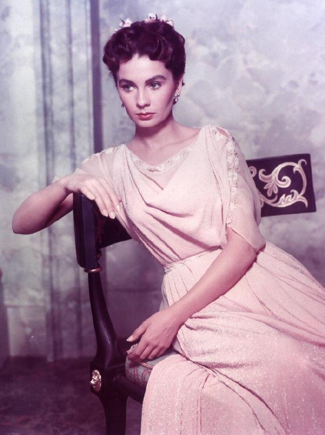
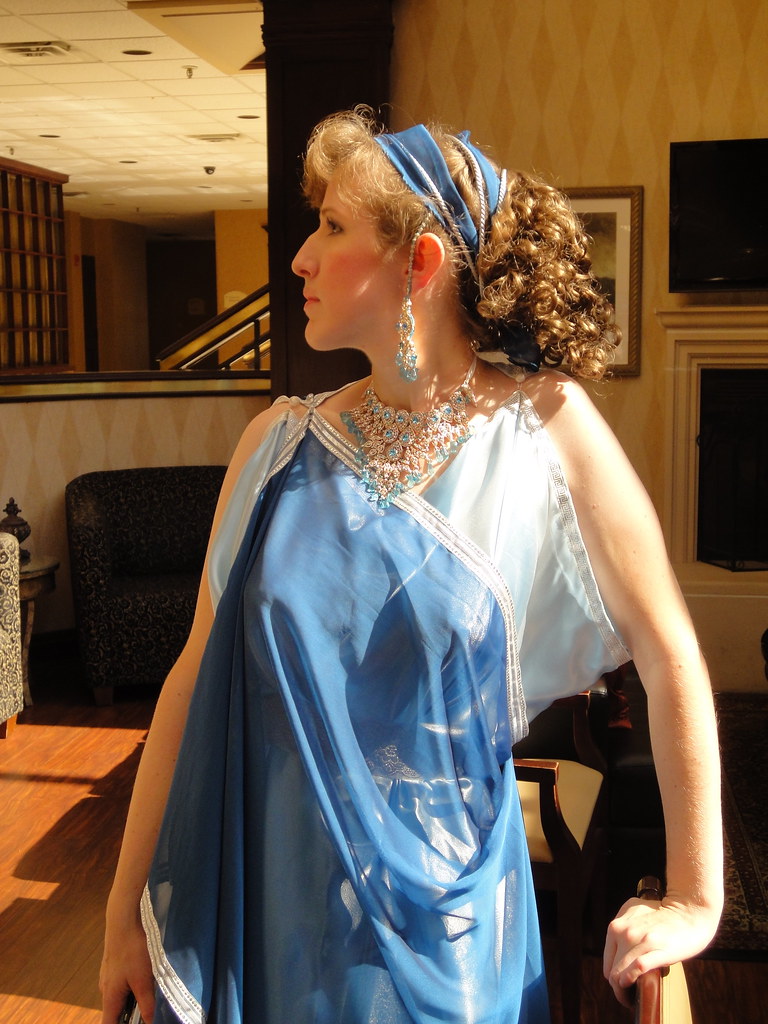
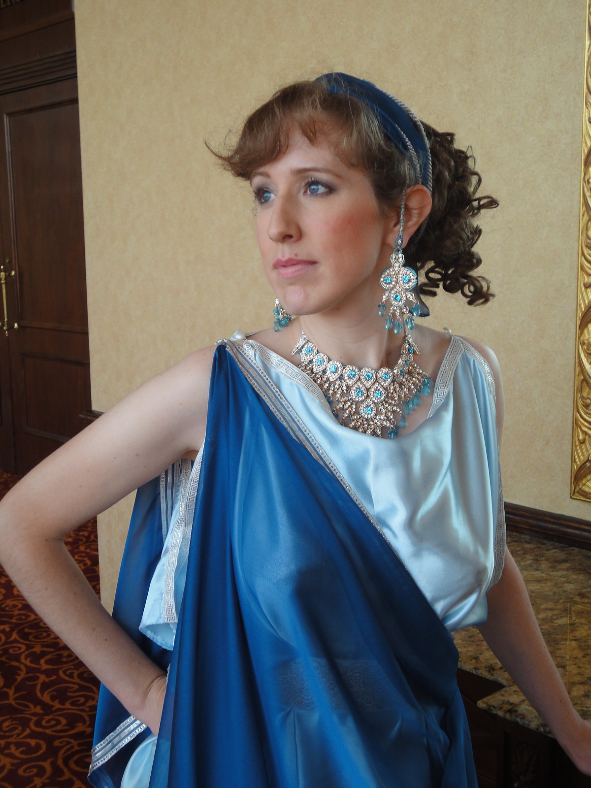
One of the things I've always loved about Costume College, years before I ever considered going myself, is the online planning, with lots of discussions and eye candy.  This year, an idea by Loren of The Costumer's Closet was for Roman loungewear, inspired by shows like "Rome" and "Spartacus."  I'm not a fan of the shows, but film-inspired Roman sounded really fun! Particularly since the Costume College theme was classic Hollywood.  So I went for Technicolor Roman: brightly-colored, meticulously made up, and supported by classic 1950s foundations, as inspired by films like Ben-Hur, The Robe, and the original Spartacus.

Jeanne Simmons and Richard Burton, The Robe

Jeanne Simmons, The Robe

Jeanne Simmons and Lawrence Olivier, Spartacus


My Technicolor Roman actually debuted at Costumers' Lost Weekend, at the Time-Traveling Brunch.

I love how the sun lights up the satin right through the chiffon! (Photo courtesy Jennifer Thompson)


Photo courtesy Jennifer Thompson


I made a few changes for Costume College, including the hairstyle. I used my new hairpiece, anchoring it up higher, and changing the ornamentation a bit; and I curled my bangs, which ironically ended up looking more truly Roman than 1950s. :D I also switched shoulders on the chiffon over-robe, and figured out it both looked awesome and stayed out of my way when I carried it over one arm.  Technicolor Roman beauties don't trip on their own robes!

So far, I've only found one picture. Sadness! I like it, though.

Photo courtesy Noelle Paduan "Lbc42"


 While a Technicolor Roman I assisted in Jennifer Rosbrugh's Dressing the Silhouette class. It was pretty funny to be up there with those ladies all nicely dressed in their 19th and 20th century pretties, and me in my gaudy synthetic metallic draperies! It was fun.


I also went to Angela Burnley's class on the fabric swatches from London's foundling hospital. AMAZING!! The variety of prints is incredible. Also eye-opening was the very few solid colors of linen: blue, blue, and more blue, with some brown and some gold. Wow.  I also got the Threads of Feeling book, sold at Burnley & Trowbridge.


Then it was back to our rooms to prepare for the evening. More to come!


Friday, September 21, 2012

Pondering Construction on the Met Gown

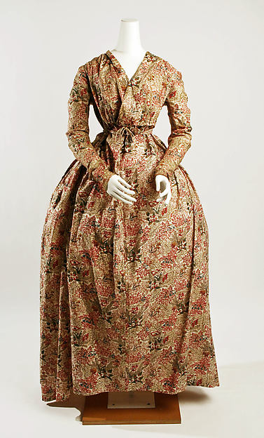
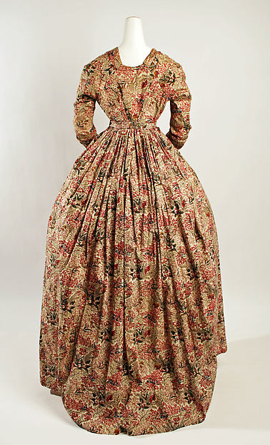
I mentioned last week that I'm participating in the Curtain-Along.  I'm going to use the red curtains, and try to reproduce this dress, from the Met.

The Metropolitan Museum of Art, Accession Number 2004.441 (The pictures of it below are hosted on my Flickr.)


It looks like a plain round gown with a wrap front.  I thought it was at the natural waist, but now I'm thinking it is high-waisted. But on closer inspection:

(1) The wrap fronts are "floating" away from the waist of the gown.


(2) There is clearly a drawstring tie, but it is centered on the gown, in the middle of the top wrap panel.
(3) There is dress material behind the bodice wrap panels.


I've been puzzling about this for some time.  It's mounted rather poorly (just look at the skirt!), which does not help.  It may have been worn by a much larger woman than the mannequin as well. I'm not certain it wasn't rearranged between photographs. And although the zoom function is powerful, the photos do not have high enough resolution.  Possible solution:

1. The front bodice is a mock wrap. The panels are stacked onto each other and a single drawstring channel is sewn. Then it can be drawn up evenly from the middle. It is not attached to the skirt at all.

2.  The skirt is an apron front with dress fabric at least partly above the waist, so as to keep lining material from showing in case of gapping. Possibly only slightly gathered for the original wearer, but gathered more tightly for the mannequin.

My theory:
-->  Regular 18th century apron front gowns had the front skirt just pleated to a band or tape that tied around the body under the gown. The bodice dipped below the waist and there was little opportunity for gapping.  However, if this is a brand-new-style high-waisted gown, combined with the newer straight-waist bodice, there is very great risk of gapping (particularly on a larger woman), and a new solution comes up: Add extra material to the skirt front above the waist.

Even with this theory, I'm still not sure what the underbodice will look like.  I need to look at other very early high-waist gowns and try to find some construction details. I'm familiar with Regency "apron front" gowns, but this is different.


I did find a couple of things on Pinterest. Nothing 100% spot-on for the look, but things that look similar in construction, and I can see how that dress could have been intended to look.

I like this one. Long sleeves, still natural waist, crossover. Plus a crazy ruffed undershirt thing and turban!


 (Higher resolution here.)

There's a couple of KCI ones that I'd like to look at in more detail.


This is another option: instead of the fronts overlapping, just tying together at the waist.


 I'll leave you with one last picture, of the back. Three seams on each side! SO fun. :D

Tuesday, September 18, 2012

Bleh! or, What do I really like?

I've just skimmed a bunch of home style/design blogs, and I have to say, I do not like the VAST majority of what I see.

  • I don't like edgy contemporary. Never, ever have. Anything surreal, stark, abstract - not for me.
  • I don't care for "chic," shabby or otherwise. Shabby looks rundown and abandoned. Things that should be rotting in the barn don't belong in the living room. Non-shabby is very aware of how cute it is.
  • I like old-fashioned stuff that doesn't look old. Keep your tea-dyeing to yourself!
  • I don't think I like anything "Parisian"... hard to quantify, but this is just a preference. Combination of stuffy luxurious colors and textures with cold wrought iron and trendy "contemporary" stuff. Maybe it's supposed to be sophisticated, but it's not me.
  • I don't like too much obviously decorative stuff. I don't mind collections or themes. I mind lots of useless junk creeping out from every corner, shelf, and countertop, clearly chosen just because it fits the color combination of the moment. It's stifling.
  • I don't like minimalism. It's cold and unwelcoming, and just as pretentious.
  • I don't like overhead lighting. The shadows are unnatural in a building, and it tends to be harsh. When it's not harsh, it's too staged, like a set.
  • Bare floors are cold, hard, and unforgiving. I'm a grown-up rugrat who lives with bare feet and likes sprawling on the floor. Carpet is good.
  • There is nothing lovely to me in a neutral palette. It's bland and has no interest. One chair in an obnoxious color does not redeem it, either.
  • I don't like over-coordination. Not everything has to be perfect.
  • I don't like the trainwreck of colors, styles, and patterns that passes for eclectic.
  • I don't like most "Victorian" interiors, either. Too much lace, frills, and stifling luxury.

After that boat-load of negativity, what DO I like?

Typing up what I don't like really clarified things. Particularly when I noticed how a number of my dislikes are paired. I don't like either minimalism or maximalism. I don't like all neutrals, and I don't like all clashing color.

Here's the one picture I pinned, that I totally love. From the Antique Style blog.

Yes, VERY antique.  But it doesn't have to be very antique for me to like it, I assure you of that.  If I did, why don't I like more modern decorating schemes?  Antique influence is HUGE, and to be found everywhere except in the strictest contemporary/abstract schemes.

I think my requirements are that:
(1) It be pleasing to my tastes, which do incline to the traditional and classical
(2) It be welcoming and pleasant
(3) It be genuine.

That last begs some explanation.
  • "Chic" style isn't genuine, or real, to me. Furnishings and decor are deliberately aged, or bought because of how aged they are, and often put in places they never would have been originally, or where they would never have gotten their current worn look. And then often cutifying them with ribbons, lace, and doilies. Personally, I can't get past the artificiality and proclaiming that this is Shabby Chic Style.  This is by no means a criticism of choosing antiques and vintage items for their intrinsic identity or utility. Aging is natural.  I want a certain style of vanity table that to my knowledge has never been reproduced. When I find one, I know it won't be perfect, and that's fine with me.  The thing is, I'm not choosing it solely because it's imperfect.
  • In that vein, I like old things, or reproduction things, that don't look old. I love discovering how things looked way back then, when they were new and colorful and sturdy. I love antiques, but I won't fill up my home with them, because they're not always comfortable for me, and definitely not always for guests. I want them to enjoy my home.
  • I both dislike and don't mind decor/clutter. (Decor becomes clutter when it covers nearly every surface.)  It depends on what the clutter is. If it's "decorator stuff," yuck!  Open the windows and get me some space!  But if it's your own stuff, pictures, collections, your own dishes, I'm okay with it.  It's yours, you live with it, you genuinely like it. You didn't just get a load of random stuff that fit the decor colors, and which you'll unload in a year or two when you get sick of it.
  • I both dislike and don't mind clean, open spaces.  I dislike it when the effect is Minimal! See How With the Trend This Space Is!  I like welcoming spaces, and minimalism is very rarely welcoming.  However, I also like clear white walls with space on them, clean color schemes like blue and white, and a distinct lack of frills. Maybe it's my Regency/Federal/Classical side. To me, the color and decor, even if simple, are welcoming and soothing if it feels personal enough.


*   I like a balance of coordination.  I definitely prefer for there to be unifying schemes; it's relaxing. But it's stifling when EVERYTHING matches, and the space crosses the line into Decorator Set Piece. Too much contrast is hard to handle, though. The eye is jumping from one thing to another. My ideal is a coordinated space that yet has enough personal preferences and whims that don't really fit in to make it lived-in and real.

*  I don't like "Victorian" style because of the aforementioned overload of lace, ruffles, flowers, and cuteness.  I do like (most, not all) genuine Victorian interiors, though. "Victorian" style cherry picks the floral, the lace, the velvet, and the pink, but misses in other places: dark, solid wood; other jewel tones; Oriental rugs in strong, abstract patterns; portraits and landscapes instead of pretty girls; books instead of teacups; etc.  True Victorian style spans 80 years and there's a huge variety within it, but the modern re-interpretation is stuffy and articifical to me.

* I love almost all true antique interiors, with a particular love for Federal and early Victorian.  I like the spectrum of clean lines and light colors with classical elements, all the way to more intricate heavier furniture that's still not drowned in overly ornate interiors.


So a big theme in Balance. Not too much this, not too much that. Decided leaning toward the classical.  And over all, welcoming and comfortable.

Am I totally out in left field out here? What do YOU value the most in decorating?

Wednesday, September 12, 2012

Join the Curtain-Along!

The blog got away from me! I've had a bunch of Real Life affairs come up.  Being a new and inexperienced "official" blogger, I haven't had a buffer of posts to go up to cover my absence.  But the plan is to get back on track with my Costume College re-cap in a few days, then to mix up more analysis of my Costume College outfits themselves with other topics.

In the meantime, I wanted to spread the word to check out Jen of Festive Attyre's new Curtain-Along


Basically, the home improvement store Lowe's is currently selling cotton curtains in an appropriate 18th-century print.  The price works out to about $9/yd, which is standard for a good reproduction quilting cotton, and way cheaper than the regular price at Joann's for home dec fabric. There are other sources and other colors, too, in her blog post.

The Curtain-Along isn't a sew-along as such, but it is a voluntary giant group-inspiration project. It's going to be fascinating to see all the different garments that can be made from this print!

Check out Jen's Pinterest board for direct links to the curtains and current projects using the fabric, and her indienne print board for inspiration.

I already have an indienne print cotton gown in a blue and green on white pattern.  I'm thinking that RED this time would be a lot of fun! And this 1790s gown from the Met is really starting to intrigue me...

The Metropolitan Museum of Art, Accession Number 2004.441

The Metropolitan Museum of Art, Accession Number 2004.441